We began by reviewing the initial branding direction, including their colour scheme, logo, and early mockups. Since the brand was still developing, we worked closely with their vision and translated it into a structured and cohesive website experience.
Given that this is a financial product, a strong emphasis was placed on clarity and reassurance throughout the site.
From there, we designed and developed a customised website that included:
- A clear and structured layout to introduce the card, its benefits, and how it works
- Content planning focused on simplifying financial information so users can easily understand the product
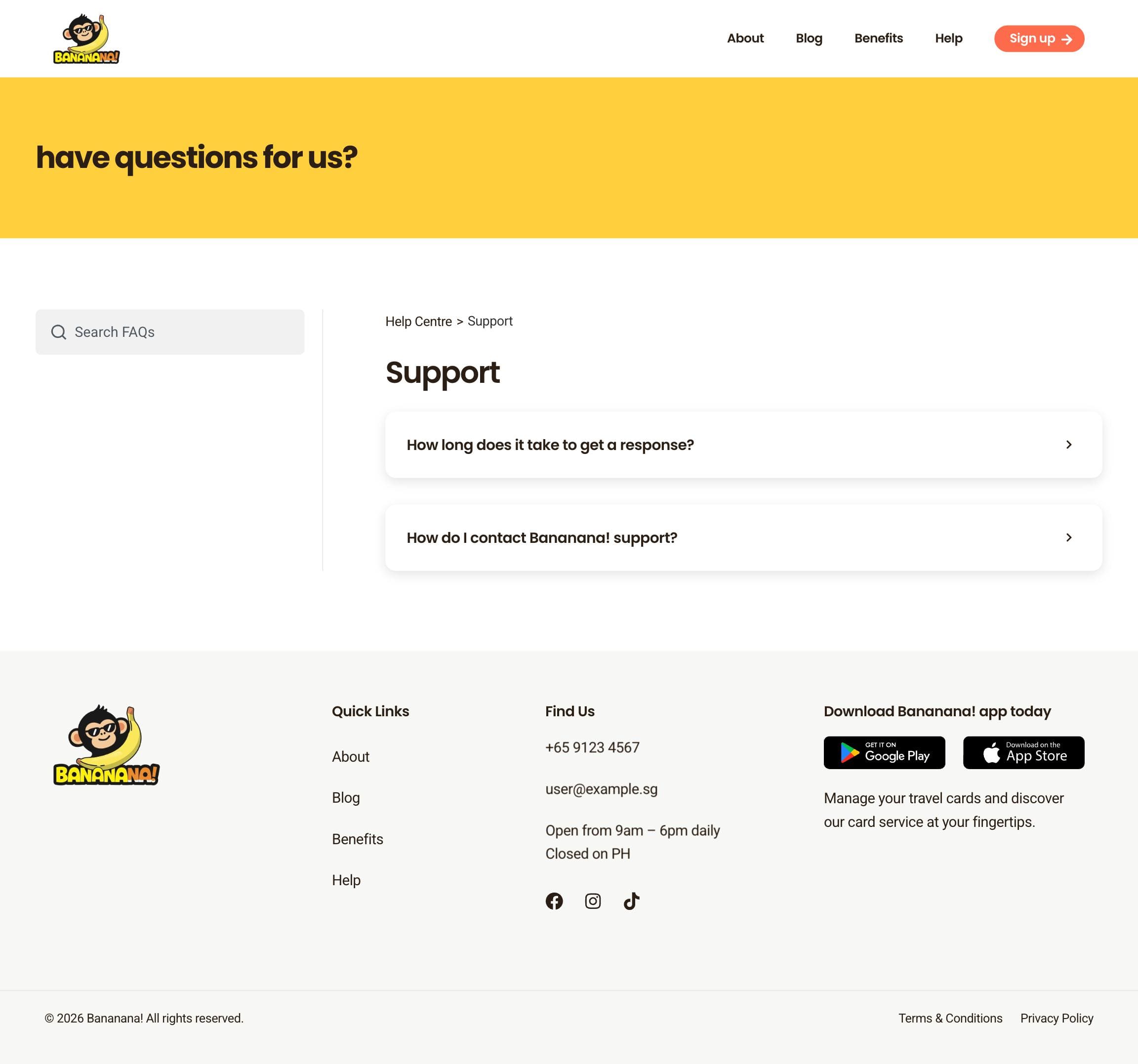
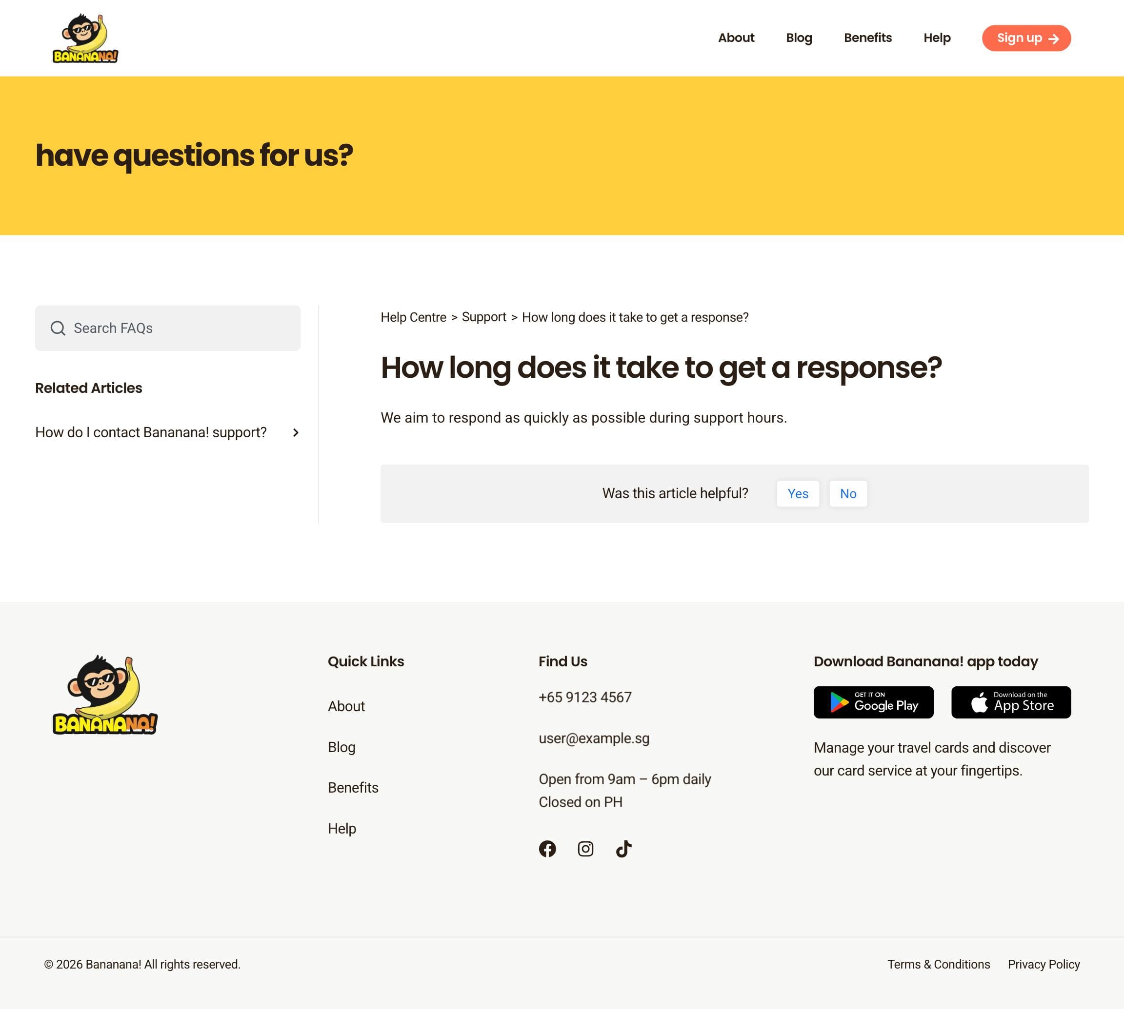
- A comprehensive FAQ and help section to address common questions and reduce hesitation before sign-up
- Thoughtful information hierarchy to guide users from awareness to consideration
- Visual direction aligned with their early branding to ensure consistency as the brand grows
- Mobile-responsive design to support users researching and applying on the go
The final site focuses on clarity and trust, giving users the information they need upfront while supporting the brand in its early growth stage.